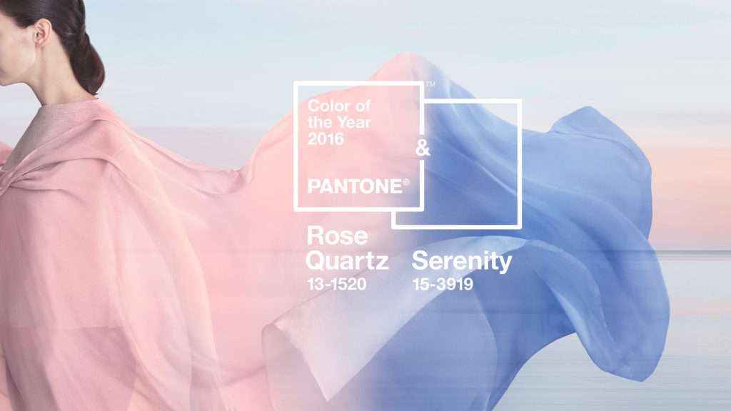
In December, Pantone announced their colour for 2016 and it was a bit of a surprise to most of us. Not because of the colour they picked, but because they announced not one, but two, making a splendid duo that works ever so well- Rose Quartz and Serenity .
Source: Pantone
And the philosophy behind the choice?
Pantone have really delved into the realm of modern life this year. There’s never been a bigger focus on wellbeing and happiness. Last year saw the rise of adult colouring books, which then became mindfulness colouring and a few even touched on meditation too. So hearing that the Pantone palette draws on this trend and that they’d strived to create the perfect balance between warmth that comforts and coolness that soothes and calms is actually a clever idea.


The second inspiration comes from a topic that has been filling popular culture, from celebrities, to fashion and film. It’s the ever growing fluidity of gender. 2015 brought us Caitlyn Jenner, a rise in transgendered stars, ungendered fashion and the slow destruction of gendered toys.
As for fashion, especially home fashions, this combination is a dream. We know that blue is a fantastic choice for rooms such as the bedroom, since it calms and promotes restful sleep, but the addition of blush pink adds a serene warmth and oozes elegance. And the In My Dreams roller blind below, shows just how simple this colour palette can be.

Pantone’s board on Pinterest has some excellent inspiration for both the wardrobe and the home. It’s dreamy and delicate- just how a palette should be.
Why not head on over to tuiss now and browse our collection of blinds and curtains to kickstart your year of colour. Shop Rose Quartz and Serenity now.